
Page 99 - ITU KALEIDOSCOPE, ATLANTA 2019
P. 99
ICT for Health: Networks, standards and innovation
Tabler dashboard toolkit [13].
4. USABILITY STUDY DESIGN
In this section, we describe the procedures and details of our
user study. Overall, our user study is divided into two parts:
1) The evaluation of the existing user interface and 2) The
newly proposed interface. We focus on two core functions of
the system - search and registration in this study.
4.1 Participants
Figure 3 – The issue of the interface - no distinction between
regular and critical operations For the first part of the user study, we recruited 30
participants from Ghana, Cameroon, and Nigeria through
system administrators of C4G BLIS in each country. For
the second part, we recruited 21 participants from the three
countries through the same method. To be eligible to
participate in both parts of the study, participants were
required to have a prior experience of using C4G BLIS.
Personal information such as age, education, and gender were
not collected in accordance with the research guidelines of
the Institutional Review Board of Georgia Tech. The system
administrators and participants were not compensated for
their participation. Part 1 took 17 weeks to complete and
Part 2 took 7 weeks.
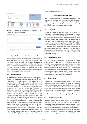
Figure 4 – The proposed interface of the Results.
4.2 Data Collection Tool
can resolve this issue by placing the same components in the
same positions across all the pages. Another problem with For both parts of the user study, we used the same data
the current interface is that there are no visual clues to inform collection tool, HotJar, which is an advanced logging and
the users of critical task execution (see Figure 3). The users analysis system that reveals the online behavior of users
should be cautious while performing important tasks such as [14]. Particularly, the visitor recording feature allows us
deleting a user or a test result. For such an issue, modern to eliminate guesswork by recording of users’ actions while
user interfaces tend to highlight the buttons related to crucial using C4G BLIS. By observing the participants’ clicks, taps,
tasks with noticeable colors or shapes. and mouse movements, we could identify usability issues and
compute the execution time of given tasks. Figure 6 presents
3.3 Design Proposals a captured image of the HotJar system interface.
In order to resolve the interface problems noted in the previous 4.3 System Setup
section, we redesigned the user interface with the focus
on visibility, efficiency, consistency, and adaptability of the To protect personally identifiable information of real patients
system. Figure 4 shows the consistent style and location in the participating labs, we decided not to run the evaluation
of the search options and button in different pages of the on the systems in use; instead we set up the latest version of
new user interface. The size of actionable components C4G BLIS in a Google Cloud server with dummy data set
is also increased. The left side of Figure 5 presents the and dummy login credentials. Since the access of the Internet
Registration page of the new user interface. There is a clear and the supply of electric power are sometimes unreliable,
visual distinction among all the different function blocks: regional administrators were asked to check whether they
Search, Tips, and Results. In the Search block, we kept could access the system before participating in the study.
the same style and layout of search options and button like
other pages. In the Result block, we distinguished the data 4.4 User Study Procedure
and buttons by providing a visual clue, a rounded rectangle,
and highlighted critical actions (e.g., Delete) with a red color. Since the research team is based in the US, and the target
Most importantly, the proposed interface is responsive, which users are based in Africa, we were not able to visit the
means it can adjust its layout and elements to the user’s laboratories where the user studies were conducted. Thus,
screen setting. The right side of Figure 5 shows the same we trained the system administrators in the target countries
registration page accessed from a smartphone. The three through conference calls and documents shared over e-mails.
blocks are vertically re-arranged, and the components of each Later, the instructed administrators conducted the user study
block are also re-configured (i.e., their size and position are on-site. The training process for the administrators took
different). We implemented the proposed interface using about one hour per person. As shown in Table 1, our user
– 79 –