
Page 101 - ITU KALEIDOSCOPE, ATLANTA 2019
P. 101
ICT for Health: Networks, standards and innovation
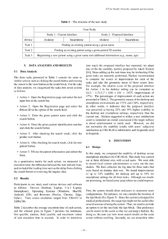
Table 1 – The structure of the user study
User Study
Study 1 - Current Interface Study 2 - Proposed Interface
Device Desktop Smartphone Desktop Smartphone
Task 1 Finding an existing patient using a given name
Task 2 Finding an existing patient using a given patient ID number
Task 3 Registering a new patient using a given name and additional information (e.g., name, age)
5. DATA ANALYSES AND RESULTS how much the proposed interface has improved, we adopt
one of the the usability metrics proposed by Jakob Nielsen
5.1 Data Analysis [16]. Since adding up the task times may be misleading if the
given tasks are unevenly performed, Nielsen recommended
The three tasks presented in Table 1 contain the same or to compute the scores of improvement for each of the
similar actions such as clicking the search button and moving tasks and take the geometric mean of these scores later.
the cursor to the view button in the result block. For the sake For example, the relative score of the proposed interface
of data analysis, we categorized the tasks into seven actions for Action 1 in the desktop setting can be computed as
as follows: ((2.5 − 1.7)/1.7 ∗ 100) + 100 = 147% (improvement of
• Action 1: Open the Registration page and select the text 47%). The percentages of improvement of each action are
input box in the search bar. presented in Table 2. The geometric means of the desktop and
smartphone environments are 132% and 134%, respectively.
• Action 2: Open the Registration page and select the In other words, it indicates that the proposed interface
Patient ID in the option of the search field. was perceived as having 32% and 34% higher usability in
the desktop and smartphone settings, respectively than the
• Action 3: Enter the given patient name and click the current one. Nielsen suggested to utilize a user satisfaction
search button score to formulate an overall conclusion if the target website
• Action 4: Enter the given patient identification number is about entertainment or rarely used. However, we did
and click the search button not normalize the usability results with users’ subjective
satisfaction as C4G BLIS is informative and frequently used
• Action 5: After checking the search result, click the in hospitals.
profile view button
6. DISCUSSION
• Action 6: After checking the search result, click the new
patient button 6.1 Design
• Action 7: Fill out the patient information and submit the In this study, we compared the usability of desktop versus
form. smartphone interfaces for C4G BLIS. This study was carried
As a quantitative metric for each action, we measured its out at three different sites with actual users. We were able
execution time, the difference between the start and end time, to recruit local system administrators to carry out the user
and excluded the loading time such as the delay from clicking studies. We then collected the log data for three tasks that
the search button to retrieving the inquiry data. were based on dummy data sets. We found improvements
of up to 32% usability for desktop and up to 34% for
smartphone settings for all three tasks. Although our results
5.2 Results
are promising, we found some areas where we could improve.
Participants in our study used various devices and software
as follows: Devices (Desktop, Laptop, 2-in-1 Laptop,
Smartphone), Operating Systems (Windows, MacOS, First, the system should allow end-users to customize more
Android, iOS), and Browsers (Firefox, Chrome, Edge, configurations. For instance, we can consider the location of
Safari). Their screen resolution ranged from 320x432 to the tips block (See Figure 5). Since the system is designed for
1600x786. medical professionals, the usage tips might not be useful after
several sessions of using the system. Thus, we need to provide
Table 2 describes the average execution time of each action, an option to let the user hide the tips block. This preference
and the whisker plots in Figure 7 presents the minimum, can be stored in the cache so that we can keep it hidden. By
first quartile, median, third quartile, and maximum values doing so, the user can view more search results on the same
of task execution time in seconds. In order to determine screen without scrolling. Secondly, we can streamline other
– 81 –