
Page 718 - Shaping smarter and more sustainable cities - Striving for sustainable development goals
P. 718
video, databases, streams, models, archives, and anything else. Nowadays, excess amounts of open
data are overwhelming; raw data becomes useful only when we apply methods of deriving insight
from it. Fortunately, we humans are intensely visual creatures. Only trained professionals can detect
patterns among rows of numbers, but even young children can interpret bar charts, extracting
meaning from those numbers' visual representations. For that reason, data visualization is a
41
powerful exercise . Visualizing data is the fastest way to communicate it to others. The definition
42
of data visualization references its two objectives: understanding and communication . This can
also be referred to as exploratory and explanatory the visual representation of data respectively.
This distinction is often overlooked, but it is extremely critical in the process of creating successful
data visualization. If the motivation is to make sense of data, then the data visualization should be
exploratory in nature. The process of visualization can help to see the world in a new way, revealing
unexpected patterns and trends in the otherwise hidden data around us. At its best, data
visualization is expert storytelling. However, if the analysis of the data is complete, then infographic
43
should be used. More literally, visualization is a process of mapping complete data to visuals . It is
possible to craft rules that interpret data and express its values as visual properties. Without being
conscious of one's data visualization motivations and goals, the process can be inefficient,
misguided, or altogether unsuccessful.
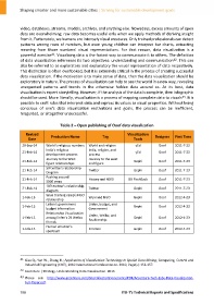
Table 2 – Open publishing of Ooof data visualization
Revised Production Name Tag Visualization Designer First Time
Date Tools
29‐Sep‐14 World's religious numbers World and religion yEd Ooof 2011‐7‐23
India's religious India, religion, and
21‐Feb‐14 yEd Ooof 2011‐7‐23
development process process
Journey to the West Journey to the west
21‐Feb‐14 Gephi Ooof 2011‐7‐23
figure relationships and figure
50 twitter's relationship
21‐Feb‐14 Twitter Gephi Ooof 2011‐7‐23
Diagram
Pushing around
21‐Feb‐14 History and 4000 BB FlashBack Ooof 2011‐7‐23
5000 years
107t twitter's relationship
21‐Feb‐14 Twitter Gephi Ooof 2011‐7‐23
diagram
Wuxi training camp's NGO
1‐Feb‐13 Wuxi and NGO Gephi Ooof 2012‐4‐23
relationship
Linfen's government Linfen, budget, and
1‐Feb‐13 Gephi Ooof 2012‐4‐23
budget information Government
Relationship Visualization
1‐Feb‐13 among linfen's 29 Weibo Linfen, Weibo, and Gephi Ooof 2012‐4‐23
Realtionship
friends
Human emotion's
1‐Feb‐13 Emotion Gephi Ooof 2012‐4‐23
spectrum
____________________
41 Xiao Q., Yan W., Zhang H.; Application of Visualization Technology in Spatial Data Mining; Computing, Control and
Industrial Engineering (CCIE), 2010 International Conference on. 2010, Page(s): 153‐157.
42 Accenture | Strategy. Understanding Data Visualization. 2013
43 Please see: http://www.accenture.com/SiteCollectionDocuments/PDF/Accenture‐Tech‐Labs‐Data‐Visualization‐
Full‐Paper.pdf.
708 ITU‐T's Technical Reports and Specifications